cyrano@lemmy.dbzer0.com to Canada@lemmy.ca · edit-21 month agoSchooled by Trump, Americans are learning to dislike their allieswww.economist.comexternal-linkmessage-square22fedilinkarrow-up1144arrow-down13file-text
arrow-up1141arrow-down1external-linkSchooled by Trump, Americans are learning to dislike their allieswww.economist.comcyrano@lemmy.dbzer0.com to Canada@lemmy.ca · edit-21 month agomessage-square22fedilinkfile-text
https://archive.is/2025.04.01-221630/https://www.economist.com/graphic-detail/2025/03/31/schooled-by-trump-americans-are-learning-to-dislike-their-allies
minus-squareeasily3667@lemmus.orglinkfedilinkEnglisharrow-up1arrow-down3·edit-27 days agodeleted by creator
minus-squarePyroNeurosis@lemmy.blahaj.zonelinkfedilinkEnglisharrow-up1·1 month agoThey’re getting heated yeah, but I don’t see the issue with the graphs. The x-axis is the year (not labelled, but reasonably inferred) The Y-axis is percent of Americans agreeing (numbered on the right instead of the usual left, but explained in the header)


deleted by creator
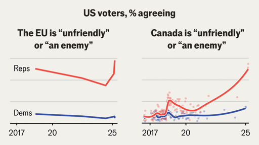
They’re getting heated yeah, but I don’t see the issue with the graphs.
The x-axis is the year (not labelled, but reasonably inferred)
The Y-axis is percent of Americans agreeing (numbered on the right instead of the usual left, but explained in the header)